Sunday, December 8, 2013

A simple tag for Sunday


Fast and fun, here's a simple tag for grins.

You normally would not use a Halloween stamp for a Christmas tag but I find these little Stampotique tykes very versatile, rising to any occasion.

Add any hat to Corie and Voila, she is no longer a witch.

There is really nothing to disguising the images.  Stamp on scrap paper to create patterns for new outfits.  Cut and piece.   Add Ranger Liquid Pearls in white opal for hat fluff.


Thursday, December 5, 2013

Free Christmas Tags


Happy Holidays from Vera Lane Studio!
Enjoy this colorful Christmas tag. Right click to save. 
Copy, paste, and adjust size in a Word Document.  Print and cut!


Janet

Saturday, November 30, 2013

2014 Stampotique Designer's Blog


You have arrived on Vera Lane!
I’m excited to join the  2014 Stampotique Designer’sBlog team.  I will be posting on the Stampotique Designer's Blog Thursdays, come rain or shine. 


I have been designing images for Stampotique for about thirteen years and now I get to be on the other side, blogging my head off about these great stamps.

Our Design Team is absolutely inspiring, and often times genius!  If  you are new to stamping, a casual stamper, or hobby hooked, no doubt you will find inspiration from the weekly Designer's Challenges.

Not all rubber stamps are created equal.  Stampotique art stamps are not computer rendered.  You are getting the precise image directly from the artist's pen.  This is why art created with Stampotique art stamps looks so different from many mass produced stamps. 

So if you are not already a fan of Stampotique, please bookmark the above links.  Don't wait until 2014 -- join us now!

Janet


Friday, November 22, 2013

New nine image digi set for the holidays

 There is a new 9 image holiday digi set  available in my Etsy shop.  This set is a variation of images I created for Creative Publishing's  recent issue of Simply Cards & Papercraft.

 Images and sentiments are combined to create endless combinations of holiday cards and tags.  The designs are perfect for paper piecing.

When paper piecing your digital images, it is wise to scale down your paper size. Trim your scrapbook paper, and adjust in your printer's paper size settings.  For the tree, I printed on blank cardstock as well as a variety of scrapbook papers.  Once I cut out all my scrapbook sections I arranged the various patterns and glued them in place.  The tree was cut again and mounted on color coordinated papers.  Metal snowflake brads and Ranger Liquid Pearls were added accents.

Glue dots were used to make the images dimensional.  A little Distress Ink was applied to the paper sides after lightly sanding the edges.

Coordinate your papers for a monochrome look or use color opposites for some contrast.  I think the tree in combinations of pinks and cream would make a lovely and different holiday card.

Tuesday, November 12, 2013

Modeling Paste, Gesso, Stencils


Prior to Stampotique's Designer's Challenge last week I had created a stack of backgrounds utilizing stencils, modeling paste, and gesso. 
I have a heavier gesso that worked well with a stencil, the lighter gesso was preferred to prime my paper surface.  While the heavier gesso works well with stencils, I slightly prefer the modeling paste for this application.

For this background: I scraped some gesso on cardstock with an old credit card.  Shades of green and blue green acrylic paint were also applied with the card. In the area behind the cat family  I masked an section to create a block image with antique border  and allowed to dry.  Modeling paste was applied through a portion of a chevron stencil.  I used  Liqutex modeling paste in a tube with a flip lid.  It's a simple motion to squeeze some paste onto the stencil and scrape.  I can flip the top back without stopping to cap a container to prevent my product from drying out.  This may not sound like a big deal, but when you are working with mixed media and accumulate a mess in the process, it is easy to neglect capping something and ruin your product.

I softened the antique border images with a light scraping of gesso.  A bit of Dylusions was sprayed on the modeling paste and wiped away. 

During this experiment session I used gesso and or modeling paste with either acrylics, spray inks, or a combination of both. My sheets were quite warped, so I used a book press to flatten them before adding them to my stash. This was not one of my favorite backgrounds but I decided to challenge myself to give it some life.

Bird in a cage and the cat family image were stamped with StazOn and embossed. Watercolor pencils were used to color the stamped images.

The rest of the piece is assembled with my usual scraps and scribbles.

I'm more of a dog person, so Carol Fox, this one is for you.

Sunday, November 10, 2013

Courage doesn't always roar

Courage doesn't always roar is a book title by author Mary Anne Radmacher.  The title inspired me to put Stampotique's Cowardly Lion to use.
At any given moment, be it ourselves, loved ones, friends, or co-workers that need that encouragement to get out of bed in the morning. Right now I can think of a few special people in my life who encompass tremendous courage, face the day without complaint and show tremendous determination and strength.  Like the Cowardly Lion, our courage is internal -- it's always there, sometimes we need a little help finding it.

I had some sheet of Arches 140lb watercolor paper that I had used for some art journals.  I took the remaining scraps and bound and 8 x 8" pamphlet stitch journal.  The pages are more random in size, just used what I had left. 
The backgrounds are sprayed with some Dylusions as well as home-made alcohol inks.  For the tag, Cowardly Lion was stamped twice.  Fibers were glued around the inside of the lion's head and a second head cutout was mounted on top. I keep paper scraps in a colored coded file on my studio counter so it allows me to do a little quick art using what I have on hand.

Tuesday, November 5, 2013

What's cooking on Vera Lane

I am still trying to settle into retirement life. I am missing the structure that my teaching position demanded of me as my ADHD personality has been having a free for all.  Was it the gym first thing this morning or studio time?  Or do I bake?
I baked.
So I thought I would share the result of research and tweaking; my healthy, nutty, Janet's (Vera Lane) homemade chunky granola. 
My measurements are never exact, but this will get you there, then you tweak to make it your own.  I always add more nuts, and the liquid may be less.  Dried fruit add in is your choice, I actually prefer this with no fruit.
Since I make this all the time, all the dry ingredients are on the same pull-out pantry shelf, so it goes by quickly and I dump everything into a large stainless steel bowl.

Preheat oven to 300 (I don't know where that little degree thingy is on my keyboard) 
Spray two cookie sheets with vegetable or coconut oil.

Ingredients:

4 heaping cups of organic whole oats ( you can use Quaker too --NOT INSTANT)
2 TBS Organic milled flax (heaping)*
1/4 C flax seed
1/2 C Raw Sunflower seeds
1/2 C Raw Pumpkin seeds
1/2 C Pecans, raw cashews or both
1/2 C Shredded Coconut
1/2 C Dried Cherries (or fruit add in of your choice)
2 - 3 turns of Sea Salt (grinder)
Combine the above ingredients and mix with large spoon

In a medium bowl combine:
1/4 C Pure Maple Syrup
1/4 Honey
1 tsp Pure vanilla extract
1/2 C Organic extra virgin coconut oil ( if it is solid liquefy in micro on low setting)
1 TBS EVOO
2 egg whites
Splash of Cinnamon powder

*I like adding ground flax to anything I bake so this is an option
** I have added a tad brown sugar time to time but it's not necessary
Sometimes I'll add Chia seeds. 

Whisk the above ingredients and pour into the dry ingredients.  Mix well.

Divide the mixture in half.  Spread on two cookie sheets, leaving a hole in the center of the sheet for even baking. (Granola looks like a ring around the pan)  Pack it down as you are arranging the mixture.
Bake for 30 minutes.  If your oven can only accommodate one sheet at a time, place one on a lower shelf and rotate trays at 15 minutes.
Allow to cool.
Break apart and store in air tight container.  I like to keep the granola in the fridge, it tastes much better cold.
I warn you, this is addicting.  When you need a little sweet and crunchy snack it's a healthy choice.  My husband loves this for breakfast with some vanilla rice milk. 
Once you make it play with the ingredients the next go round and experiment.  It's the egg white that makes the chunks, leave it out and it will be more cereal like.
If you buy boxed cereal you will never buy another box again.
Enjoy!
 

Friday, September 27, 2013

A way with washi

I love using scraps of scrapbook paper. You know, those little 1/2 inch slices that fall on the side of your paper cutter?  So while I've seen washi tape, I didn't think it was something I'd add to my crowded studio of supplies.  Use what you have, right?

However, the Stampotique designer's Challenge inspired me to pick some up to see if it was something I couldn't live without. 

The nature of the adhesive backed tape brought be back to my early days of graphic design.  Before computers.  Anyone with me?  We had an adhesive film product by Letraset.  It was used to create halftones -- there were also fonts  that cut with an X-acto blade and placed, but the sheets of semi clear adhesive film is what I'm referring to.  After the film was placed over an image, I would use a sharp X-acto knife to cut the film inside the contour of the desired shape. The transparent nature allowed the edge of the shape to show though, so one could see where to cut. 

In this doodle art I used the washi tape in that very way.  The inside of some of the petals are accented with washi tape.  I pulled out some "vintage" Stampotique ribbon border 2 and 3 to create my stems.  I used and old book and children's crayons and watercolors to create my circles -- then took a Pitt pen and doodled.  I added more washi to the border of the card.

Unfortunately I finished the card after a long day and a couple of glasses of wine, hence, my quote got a little crowded.  The quote, "I must have flowers, always, always, always" is from Claude Monet. 

Love the quote.  I'm still wishy about washi.

Wednesday, September 25, 2013

Everything you imagine is real

This is certainly one of my favorite artist quotes by Pablo Picasso.

Stampotique's Jill Penney seemed to be a perfect fit to sit on top of the Mushroom Forest with Caterpillar and Rabbit in the foreground. Of course I had to bend her little legs. 

With all the color inks and pigments I own I always seem to reach for black.  Maybe it's the (retired) elementary art teacher in me that is always drawn to black on white paper -- it's that "pop" I would train the kids to say in kindergarten on. When they got to second grade they had to use the term "contrast" -- but "pop" we all liked so much better.

Color balance, and texture variety, and always text (inspired by Paul Klee). So many years working with kids I realized I work the way I teach.

And a little humor doesn't hurt.

My card is simple, but I go for the pop.  Hope you enjoy it.

Wednesday, September 18, 2013

Happy Birthday

Kim of the Stampotique design Team is having a special birthday.  Since TODAY is her birthday I had to crank out a card in-between dismantling my studio space for my young student this afternoon.   
My littles, Fiddle, Corrie (little witch in disguise) Skullboy, Laura, Bella, Titus, and Grace without her wings are dressed with France Papillion's banner -- inverted and cut for party hats.  Simple, yet festive. No doubt it is obvious I've worked with little kids for so many years. :-)

Happy Birthday Kim! 

Need to dash!

Wednesday, September 11, 2013

New York state of mind

It's a stunning sunny morning here in Arizona.  Before I get to my projects for today I thought I would create a simple little card to wish New Yorkers a beautiful peaceful day.
Again I blend old an new images.  Buildings from my Stampotique mini city cube are cut and repeated on a background of linear watercolor washes to emphasize all is bright and beautiful.  Taxi! and Beep Beep is a new two-sided stamp from the recent release.

I hope the sun is shining wherever you are.
 

Thursday, September 5, 2013

Layers!

Sue Davies is hostess of this week's Stampotique Designer's Challenge and the topic is layers!  What a great time to integrate some new and older Stampotique images and layer away.

This little square format card layers cardstock, scrapbook paper and a square of white bristol cardstock.  My flower block (9182) is stamped with Versamark Watermark ink, heat set, with Pebble Pearlescent chalks applied as a dry wash.  Dog Family (9250), Carol's Flower, small (9166) and Roc Nicholas's bgrateful is stamped on a piece of bristol and colored with Copic markers.  Images are fixed with glue dots.  An XS Pitt pen is used to create a delicate border.   

Saturday, August 31, 2013

Stampotique New Image Release

Did you just arrive here from visiting Roc Nicholas ?  Fun right?  If not, we are BLOG HOPPING featuring the new images from Stampotique.  I'm joining the Stampotique Design Team this month to show you my new images and I couldn't resist to use a couple of new ones from Kira Nichols.  So here we go!

My little befuddled flying monkey completes the Wizard of Oz
set that was in the last release.
 Clouds, trees, shrubs, a little Paris inspiration...
 An up-cycled cigar box --- fun to decorate with Stampotique images.

And little taxi that will travel from Paris to Pisa...
 Beep, beep, honk, honk...
A little cat family
And a family of dogs... 


Kira Nichols's characters had to frolic in my little Paris
I hope you enjoyed your visit.  You are here  Janet Klein .  Below is the rest of the hop in order, follow the next hop stop and visit Kira. If you'd like to start at the beginning click here Stampotique Designer's Challenge . 

Thanks for taking a look!


Monday, August 19, 2013

New Coffee Cup Collection - Digi Stamps

There are new images in the Vera Lane Studio Etsy shop.  A fun and funky collection of seven assorted coffee cups and mugs and two additional accent stamps.  The loose style lends itself to quick coloring and card making. 

Arrange a page with assorted images of cups. Flip, re-size, overlap, and print.  Place them in a file for a last minute card or tag that can be quickly assembled.  The loose design allows for quick coloring and the simple shapes are fast and easy to cut out. 

See my previous post of how to use colored inks with your digi stamps.  You can easily create a layout and print a set of personalized notes.  Combine with envelopes and tie with a ribbon for a quick and inexpensive gift that was hand-crafted by you!

If you have any questions on how to create your digital layouts please email me.


Tuesday, August 13, 2013

Changing ink colors for digi stamps


There are a variety of ways to work with digi stamps.  Once you
become familiar with the tools in your Word program, the more you will be able to do with your images.  In this tutorial I am using MS Word 2010. 

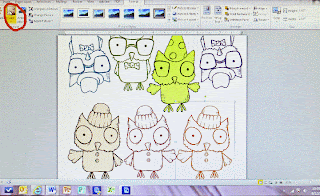
Since I like to cut out most of my images, it makes sense for me to fill a page prior to printing.  You can take best advantage of your paper real estate by flipping, turning, and resizing your images.  Fill up a 8.5" x 11" sheet --if you are not using all the images right away you have them on hand for quick last minute cards.

Images import in black and print in black, unless you tell your image to print otherwise.  There are thousands of ink colors at your fingertips in your Word program.  Match your favorite chalks, inks, Copics, Prisma, or Bic colors. 

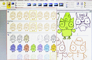
Once you have created your layout click on the image you want in a color.   An icon marked "color" will be a visible tool in the top tool bar.  Click on it and a pull out menu with lots of options will appear. 
In this screen shot I have already selected and colored several images.  Arranging images close is possible with png files.  If you are using jpeg images you will have that white box fixed around the image and waste paper.  Make sure your digi stamps are high resolution and a .png file.


The screen shot on the left shows you the many color options in the pull-out menu.  You will have a choice of tone, saturation, and color fill (which is kind of cool because the outline remains black and the image is a solid fill).
What if you want to customize your colors and go beyond the options in view?
At the bottom of the menu you will discover there are additional tools to select color variations or customize your own colors.
 I like to print on a nice white cardstock that takes media well.  My preference is Strathmore 88 lb. cover Bristol in Ultimate White.  It's an elegant paper and makes lovely note cards as well.

Before you print check your print settings.  To get a deep crisp outline be sure to select best quality  (or photo quality) as many printers have ink saving features and will default to draft print.


Any questions?  Please contact me at:  janet@veralanestudio.com


Monday, July 29, 2013

A tag for sister

My sisters birthday is tomorrow. 
I must confess, I bought a card. I did.  One of those cards that makes you burst out laughing, (we try to topper-kill
each other that way).  So with the SDC "Tag, you're it" I can at least make a hang tag for her gift.
 
I layered and lifted (paper toweled) various colors to create my background and added paper scraps on the edge of the tag.  Accented with Pitt pen and white Gelly Roll make a loose boarder.  "Sister" is stamped and cut from Kraft paper and "Midge" is stamped on the tag surface and partially paper-pieced. Prisma colors and Pitt are used to touch-up the image.
 
The ribbon is torn from white cotton that is stained from my inking fingers. It's amazing that a small simple tag can create such a mess. : -)

Friday, July 19, 2013

Fiddle

Humphrey just got his summer cut -- he is all ears.  With his slender little body he reminds me of "Fiddle" -- little simple stick dog with full floppy ears, a little sweet, a little mischievous. 

Here Fiddle is paper pieced on white on white on white...pretty simple?  I rolled a little Distress marker around the edges but I think I should have just let the shadows create the contrast. The spine of the card has a slit to accommodate the ribbon tuck.

Thursday, July 11, 2013

When I think of Paris

When I think of Paris colors I think of soft hues of linen, petal pinks, creamy coffee and tea tones.  I'm reminded of the pastel colored
macaroons and rich cup of coffee relaxing in Rodin's Garden.

Thanks to  guest Libby Hickson's of the Stampotique Designer's Challenge "French Flair" for reminding me of such pleasures and aesthetics. (I envy that you get to go every summer!)  

For this challenge I created a gift tag I cut from mat board.
The house shape is painted with a white-washed over buttercream and distressed with a little sanding and distressing inks.  Bits of soft color paper and fibers are added.  Cutout window features a portion of  Stampotique's "Little Friends" stamp and the woman figure (my husband's mother) is "Summer of 32."  I have a striped two toned pink tag that I will hang along side it that reads "Pour vous."
It was terrific fun to put off going to the gym and daydream of Paris. 
:-)  Janet


Monday, July 8, 2013

Stand-up Skeleton

I've had these craft sticks and blocks in my studio for some time.  I had
glued them together and painted them in more appealing colors and they waited to be put to use.

After completing a new set of digis based on Frida Khalo, the little Skeleton Toy character was screaming to be cut out.  He's a fast little guy to color -- and I like fast.  A little number stamp around the block , some snips and a little Aleen's Tacky Glue makes for a fun little studio friend.  When you make parts in advance, it makes it easier to put things together.

He's a great little character for Dia de los Muertos, but he's going to hang on my shelf year round.

Skeleton Toy and the Frida set are available for instant download in my Etsy store.  Enjoy!

Sunday, July 7, 2013

Matchbox Mini Books


I must confess, I had full intentions of making another one this week for the Stampotique recycle challenge but this is my first prototype that I came up with and it's structure is too cute not to share. 
If you like math (wink) you can use any size matchbox, but I have worked the math kinks out for you using two 2 1/8" x 1  7/16" matchbook boxes. 
 
The "drawers" hold a mini book each and the concertina fold which attach to each box also have a booklet in the center. When I measure, I allow for scoring and folding as you want your text pages to sit comfortably in the book spine.
 
 
Materials:
  • 2 matchboxes
  • 4" thin wire
  • 2 beads (elongated) for drawer pulls
  • 2 pieces of cardstock for mini book covers 2.5" x 1 6/8"
  • 1 piece of cardstock 5 9/16 x 2 1/2" (concertina fold)
  • 6 text pages (2 for each book but you can add more) 2 7/16" x 1 15/16"
  • 26" thin ribbon
  • Beads for ribbon ends
  • Scissors
  • Glue stick
  • Paints, papers, stamps, inks
  • Ruler
  • Bone folder
  • Paper Cutter
  • Awl ( or something to piece small holes)
  • Needle and thread
  1. Paint and decorate boxes and drawers or cover with paper.  Set aside to dry.
  2. Book Covers:  After you have cut your cardstock to size, distress, stamp, decorate as desired. The long piece is to connect the boxes and the other two are the tiny book covers.   Keep in mind that  about 1 1/2 inches in on both sides of the longer piece will not show as it will be glued to a portion of the box.
  3. Color and stamp your text pages as desired. When dry, fold pages in half and allow two sheets (folded) for each booklet.
  4. Measure, score, and fold the longer cardstock into four ( 1 3/8") equal sections(three folds).  Zigzag fold.
  5. Align the two layers of text pages in the center fold.  With all the pieces together, pierce two holes about 1/4" from the top and bottom.  Sew the text pages into the spine.
  6. Covers for the mini books:  Find the center of the 2.5" x 1 6/8" cardstock with your ruler -- (this will be your sewing line) measure and score 1/8" on both sides of the line.  Sew your text pages on the center line.
  7. Glue ribbon ends to the center of boxes first, then glue the plain ends of the folded cardstock to cover the ribbons and attach the two boxes.
  8. On one end of each "drawer" poke two holes the length of the bead and attach from the inside with a bit of twisted wire.
  9. Tuck the little books in the little drawers -- add a charm for a surprise.
  10. Add some bead embellishment on the end of the ribbons.  The assembly collapses into a tidy container -- wrap the ribbons to and tie to close.
If you are not a math person you can eyeball the picture above and use the boxes to trace onto your cardstock to approximate your measures. Please feel free to ask me any questions if these directions are not clear. 


Tuesday, June 25, 2013

Free Digi Stamp

Thanks for stopping by Vera Lane Studio!

Check the new tab, "Free Digi Stamp" for this month's release, "Spring Gal."   She's a simple yet versatile stamp that you may copy for free.

Have her float, fly, or place her in a landscape.  Using Spring Gal as a simple graphic makes 
a perfect image for gift tags, greetings, invites, a thank you, or a simple hello card.

All Vera Lane Studio images are hand drawn and 300-350 resolution. 

If you have any questions on how to use digi stamps please drop me a line at:
janet@veralanestudio.com
 

Sunday, June 23, 2013

Document Folder

A single sheet of cardstock scored and folded 1" from the bottom  makes a functional document folder. 

  1. Lay cardstock flat to stamp, color, and collage.  Measure 1" from the bottom edge and score from the back of the sheet. 
  2. Fold up at score line and rub flat with a bone folder or scissor handle.
  3. Secure folder  by attaching a button with a cord to keep your folder closed.  Make sure the cord is long enough to wrap around the folder.
  4. Create a matching envelope to tuck inside if desired.
The three Stampotique stamps used for this simple project are from Stampoptique.com.  Look for Antique Description (7228), Carol's Flower Large, 9165, and Little Friends (9154)

Tuesday, June 11, 2013

Digi Stamps now available for instant download on Etsy


I'm pleased to announce that Vera Lane Studio Digi stamps are now available for instant download in my Etsy shop. 
 
 The current catalog is available by request.  Please email me at: